There are a few ways to make sure that your website is accessible. Some accessibility issues can be identified through automated checkers such as the page check in Omni CMS. Others must be identified by manual checks.
Automated checks in Omni CMS are primarily for issues that can be identified at the code level, such as:
An automated checker in Adobe Acrobat can also check for accessibility issues in PDFs.
Some items needs to be checked via human interaction, such as:
Omni CMS includes a built-in page check that checks for spelling errors, broken links, and accessibility issues.
Adobe Acrobat provides tools for checking PDF files for accessibility issues.
Having "properly nested headers" means that the order of headers on the page is logical. Think of using headings as if you are creating an outline or table of contents on your page to help visitors find the information they are looking for.
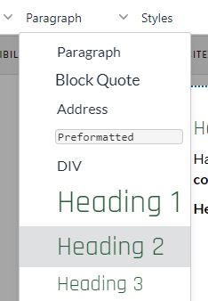
Headers can be added by selecting text and choosing the appropriate option from the drop-down in Omni CMS:

Headers serve a functional purpose in navigating pages and in providing information to search engines.
Remember, not all website visitors are able to use a computer mouse.
A simple way to test how easily your pages can be navigated and to make sure that all the page content is available via keyboard is opening your page in a browser window and using the "tab" key on your keyboard to move through the page. As you use the tab key, you should be able to move through the page in a logical order without jumping randomly from one spot to another. You should also be able to access all of the content on the page, including content in accordions or other interactive elements using the keyboard.
Embedded text in images should be only very rarely used, and only when there is no alternative solution — contact WMS for help when needed.
Images should never be the only way that information is conveyed. Not only is it not mobile friendly because images generally resize to fit the device size, which means that text on images will get smaller on mobile devices, it's also unfriendly to search engines because they cannot extract text from images to report in search results, and, of course, it is not friendly to screen readers.
Complex graphics such as charts and graphs also require descriptive text. Depending on the complexity of the graphic, descriptive text can added as an alt tag, as text alongside the graphic, or via an external linked file.
Tables should not be used to align content or configure a page layout. Tables have a specific purpose for conveying data in columns and rows.
Tables are one of the most complex page elements, and can be difficult to screen readers to interpret. Adding tables to a page requires thinking carefully about how the content in the table is associated and structuring the table in the simplest way possible. Tables should include defined table headers and descriptive captions.
When PDFs and Word documents aren't created with accessibility in mind, they can have many of the same issues as websites, including problems with navigating through the page, improperly nested headers, inadequate color contrast, and missing tags.
Remember, even if a visitor is not blind, they may have vision impairment or color blindness that makes certain fonts, text sizes, or color combinations difficult or impossible to see.
Not only are captions vital for those with hearing loss or deafness, they are also useful for visitors who are viewing videos in noisy environments, or when visitors may need to keep audio muted.