

Supporting Learning through Informational Organization
by Julie Swindler, Instructional Designer II
Do you remember newspapers? Those stacks of inky pages the neighborhood kid would unceremoniously toss onto your porch filled with information and pictures and, if you were lucky, a good comics page? Some of my earliest memories are of reading Sunday Comics with my brothers on the living room floor while our parents read the rest of the paper, occasionally pausing to discuss different articles or events. We learned a lot about the world from newspapers, in large part because of the design.
Most of us would say a newspaper is designed to be engaging, helpful, and interesting. It’s also an easy way to convey important information. So, what is it about newspapers that makes them so efficient? And what does that have to do with course design?
In her article about designing better learning materials for students, Sarah Shroeder (2021) shared her students’ experience:
My students regularly share challenges they face using teacher-created learning materials. Materials can be “wordy,” “confusing,” “hard to read,” and “boring.” But when teachers’ materials are well designed, they are “engaging,” “helpful,” “interesting,” and “easy.”
Pay Attention to Formatting
Imagine opening a newspaper and seeing a wall of text. Overwhelming, right? Yet sometimes our courses and content look just like that: a solid, impenetrable wall. Even the clearest instruction can be lost when a document is visually formidable (DuPois, 2021).
In their excellent resource on Plain Language (2016), the National Institutes of Health says, “Visually appealing documents are easier to understand. Consider how your documents look: Layout, formatting, and visual aids can help you connect with your readers and better communicate your message.”
Good course design uses similar principles to convey key information to students. You can do this by dividing course outcomes into major topics to be covered in separate modules or weeks. Or you could group similar weekly activities in sections within a module (e.g., things to read, to discuss, and to do). Yet another idea would be to keep tasks consistent across modules, so students know exactly what is expected of them.
Use Visual Elements
Visual elements like bolded words, lists, headers, and relevant imageshelp readers skim through content and quickly find the information they need (NIH, 2016; Shroeder, 2021). They also make instructional material less intimidating by dividing it into “chunks.”
Schroeder (2020, 2021) recommends the following practices when designing slides, announcements, newsletters, or online learning modules:
- Use consistent icons to trigger recall for key learning tasks. (For example, using a book icon next to the reading assignment.)
- Choose a meaningful illustration over text. (We remember things better with images, even without text.)
- Focus on your core message when choosing images and visual elements.
- Use signals sparingly (arrows, circles, etc.) to draw learner attention.
Another suggestion is to use a Learning Management System template. Contact OTL if you want to use our Canvas Course Template. It uses many of these visual design principles to create a consistent, predictable online experience for your students. You want students to spend time engaging with your learning materials rather than trying to interpret a chaotic layout.
Create White Space
Newspapers would be exceedingly difficult to read without the white space in between the columns. White space breaks up walls of text, making it easier to read and understand. You can create white space by using adequate margins, space between sections, headers, and lists (NIH, 2016).
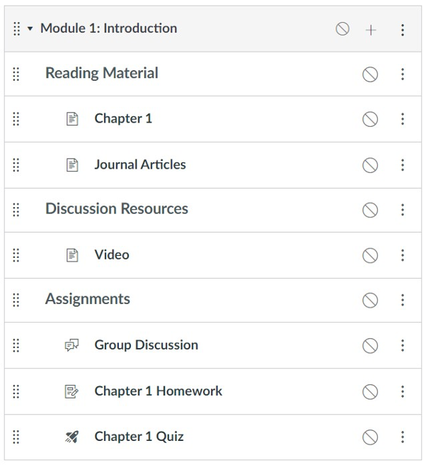
In course design, for example, you can use this principle for visual clarity by indenting content within a Canvas module. Indentations create a visual hierarchy of key information, making things easier to read and navigate. Notice the indentations in this Canvas module:
Support Working Memory
Our brains can handle only so much information at once (Cowan, 2014). To support your students in their learning, Shroeder suggests a few things to consider when creating and organizing your informational content (2020, 2021):
- Use bullets and lists; avoid paragraphs.
- Focus on learning outcomes and pare down content until you can’t trim anymore.
- Avoid unnecessary bells and whistles, challenging navigation, and too much “stuff.”
- Give learners bite-sized chunks of information.
- Break down large tasks into smaller pieces (e.g., smaller “milestone” assignments for a summative semester project).
- Provide multimodal resources such as videos alongside readings.
Conclusion
As you create your learning materials, remember to organize your information using good design. Pay attention to format, visual elements, and white space, and be considerate of your students’ working memory. More than making learning materials look good, thoughtful organization supports learning, whether it be in Canvas or the morning newspaper.
References
Cowan N. (2014). Working memory underpins cognitive development, learning, and education. Educational Psychology Review, 26(2), 197–223. https://doi.org/10.1007/s10648-013-9246-y
DuPois, T. (2021, May 18). How to become a technical writer: A beginner’s guide. Instructional Solutions.Com. Retrieved August 22, 2022, from https://www.instructionalsolutions.com/blog/become-a-technical-writer#:%7E:text=Technical%20writing%20is%20broadly%20defined,medical%20procedures%2C%20or%20environmental%20regulations.
National Institutes of Health. (2016, December 7). Plain language: Getting started or brushing up. NIH.Gov. https://www.nih.gov/institutes-nih/nih-office-director/office-communications-public-liaison/clear-communication/plain-language/plain-language-getting-started-or-brushing
Shroeder, S. (2020, July 14). Designing your LMS to make distance learning better. Edutopia. Retrieved August 27, 2022, from https://www.edutopia.org/article/designing-your-lms-make-distance-learning-better
Shroeder, S. (2021, February 1). Using lessons from visual design to make better materials for students. Edutopia. Retrieved August 27, 2022, from https://www.edutopia.org/article/using-lessons-visual-design-make-better-materials-students