At Utah Valley University, our brand is more than a logo or color palette — it’s a reflection of our unwavering commitment to student success and the unique spirit that drives us.
The words we write, the images we share, the typefaces we use, and the designs we create all help tell the UVU story. These elements work together to express who we are: inclusive, ambitious, engaged, and deeply focused on helping every student thrive in work and life.
This guide is here to help you communicate clearly, consistently, and authentically in ways that resonate with your audiences and strengthen UVU’s identity across every touchpoint. When we speak and design as one, we amplify our mission and proudly show what it means to be Wolverines.
At UVU, we tell everyone to come as you are — there’s a place for you. Our brand voice reflects that philosophy. No matter what you’re writing, if the personality and emotion behind your words match that voice, you’ll be showing what makes us Wolverines.
The UVU voice is based on four principles:
Project positive energy that empowers readers to reach their potential.
Embrace your audience and treat them as who they are: individuals and part of the UVU community.
Keep UVU at the forefront of all communication and messaging.
Appeal to your audience with honest and real communication.
When you use these principles in your writing, you’ll end up with messaging that sounds and feels like UVU’s voice. You don’t have to use all four in every message — consider your audience and objectives and select the most relevant principles.
Our university writing style guide can help refine your writing even more. If you’ve ever wondered about the official name of a building, when to spell out words instead of using numbers, or how to refer to a program or degree, we’ve got your back.
Get the editorial guideWords matter. When writing copy and headlines for UVU, consider not only the clarity and content of your message but also the feelings your words invoke.
Keep these words and emotions in mind as you write to help guide you in the right direction.
You should also keep in mind UVU’s official mission statement, values, action commitments, and objectives. These drive everything we do. Read about our mission.
Need more help with your writing? Contact University Marketing and Communications for a consultation.
UVU’s messaging pillars shape how we talk about who we are and what we stand for. They reflect our core values, highlight what makes UVU unique, and help us connect with students, employees, and community partners. These pillars are at the heart of our brand and guide our communication across campus and beyond. They help ensure that, regardless of where or how someone hears about UVU, they receive a clear, consistent message that resonates and reflects what we’re all about.
| Mission | Student Success | ||
| Messaging Pillars |
Student Potential We believe every individual has unlimited potential and deserves the transforming benefits of a high-quality education. With personalized support, every student can find a place at UVU. |
Flexible, Relevant Approach UVU meets students where they are. Faculty mentors, flexible class options, and real-world learning experiences empower students with the knowledge, skills, and resources they need to reach their personal and academic milestones, from certificates and associate degrees to bachelor’s and master’s degrees. |
High Return on Investment Investing in a UVU education prepares students to thrive. Our high-demand and work-ready graduates make meaningful and lasting contributions to their employers, families, and communities. |
| Action Commitments |
Include | Engage | Achieve |
| Messaging/ Proof Points |
|
|
|
| Values | Exceptional Care | Exceptional Accountability | Exceptional Results |
The UVU logo is more than a visual — it’s a symbol of who we are and what we stand for. Every time we use it, we reinforce our commitment to providing opportunity, connection, and excellence to the students and communities we serve.
Consistency in how we use our logo and graphic elements is essential. It’s how we build recognition, establish credibility, and express a unified voice — whether we’re speaking to future students, community partners, or national audiences. When our marks are used correctly and consistently, they strengthen UVU’s reputation and help every message land with clarity and confidence.
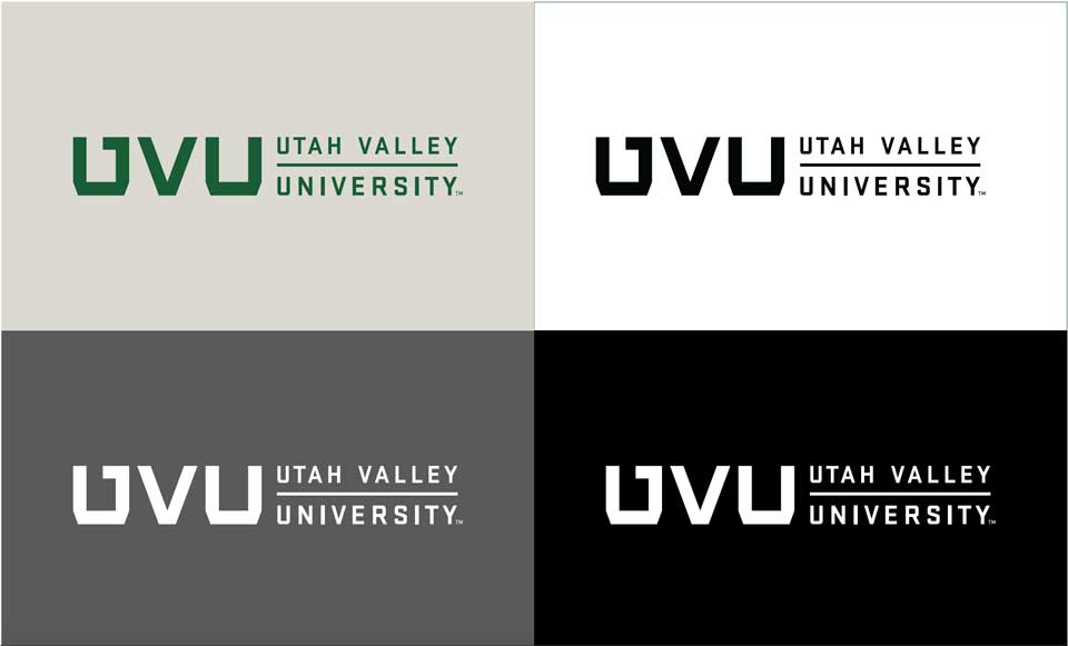
This simple logo is best used for audiences already familiar with the university. Tip: For audiences outside of Utah, the square logo is recommended over the monogram.
The square version of the institutional mark is the primary representation of the university. Tip: This should be your default choice in all situations where size, placement, and usage appropriately permit.
Designed for limited situations, the horizontal logo is intended for special use when space or size constraints exclude appropriate use of the square logo. Tip: This logo is ideal for pens or shirts or when used in conjunction with other horizontal logos.
Monogram
Square
Horizontal
The preferred color treatment for the UVU logo and lockups is UVU Green on a white background or white on a UVU Green background to ensure strong contrast and legibility. Do not place the logo on backgrounds that reduce visibility or compromise brand clarity.
Approved alternative color options are provided on this page. Logos may not appear in any other color combinations. Backgrounds shown are for demonstration only and do not imply approval for all usage scenarios. Always prioritize readability and brand integrity.
Preferred Color Treatment
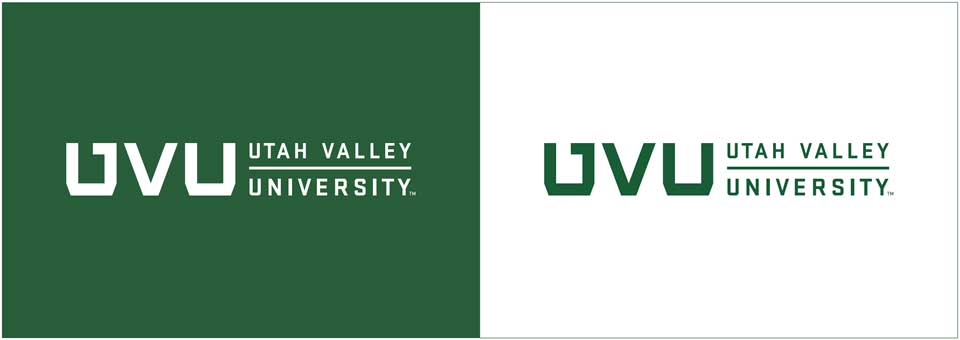
Approved Color Treatment
Always maintain proper size and spacing when using the UVU logos to ensure they remain clear, legible, and recognizable. Scale all elements proportionally to meet this standard.
There is no maximum size, but the logo should not overpower the layout. It should serve as a clear identifier, not the most dominant element on the page. However, the standalone UVU monogram may be used more prominently in select cases.
Note: Exceptions to the minimum size may be considered for small items like pens or compact ads.
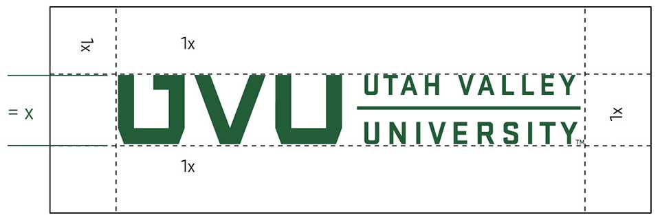
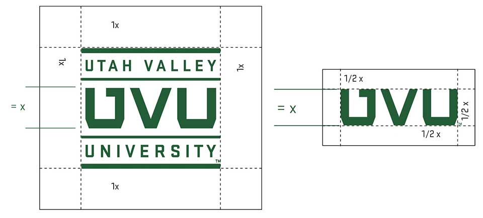
Clear Space: To determine clear space, the height of the "UVU" monogram has been defined as "x".
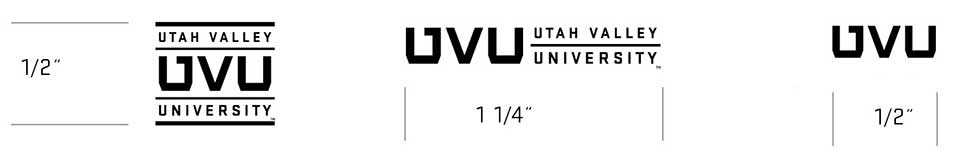
Minimum size: These minimum size measurements are only a guide and will not be appropriate for all reproduction methods, such as embroidery.
To maintain a strong and consistent brand identity, the UVU logos must remain clear, legible, and instantly recognizable. Misusing the logo — whether through distortion, color changes, or improper placement — weakens our visual identity and creates confusion.
To the right are examples of what not to do with the UVU logos. These guidelines apply to all logo variations, including unit lockups and monograms.
Always use official logo files and follow the approved brand standards. When in doubt, contact [email protected] for guidance.
Don't use unapproved colors in the logo.
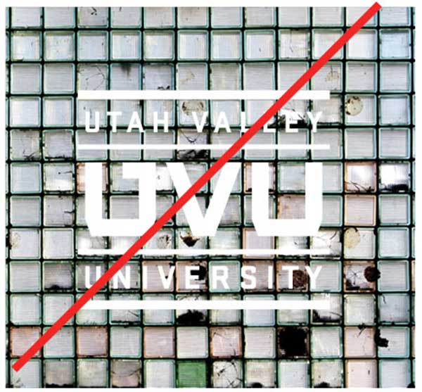
Don't use the logo on a complex photo or patterned background that will interfere with legibility.
Don't alter the typography or proportions of individual elements.
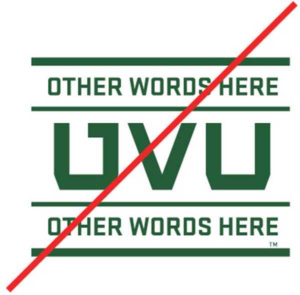
Don't combine logos or put two logos too closely next to each other.
Don't alter the proportion of the logo horizontally or vertically.
Don't fill any part of the logo with an image or designs.
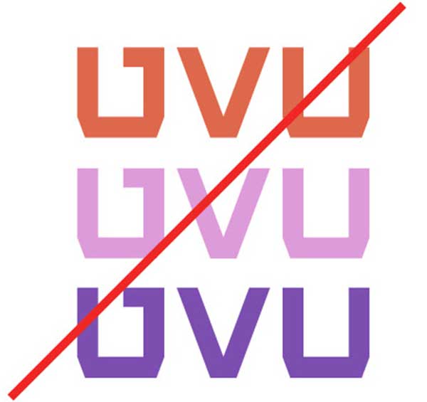
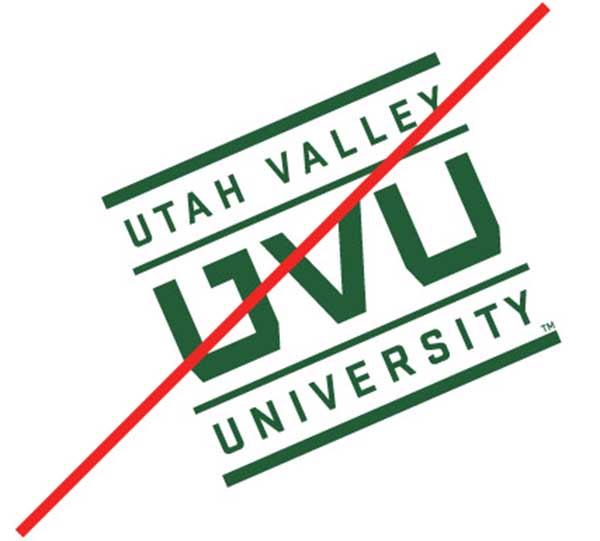
Don't use the “U” by itself.
Don't alter or rearrange any of the primary elements or use as a typography element.
Don't rotate or skew the logo or signature.
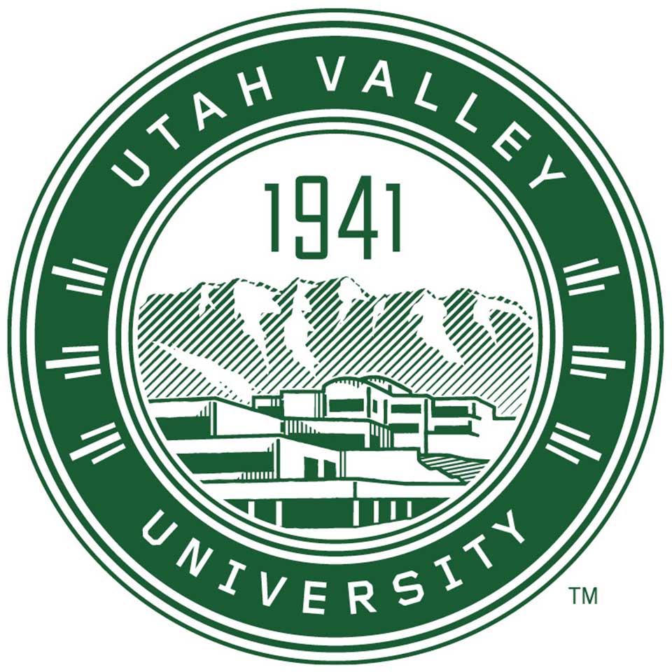
The university seal represents UVU’s legacy and evolution — from its founding as a vocational school in 1941 to becoming the largest public university in Utah. As a formal and symbolic mark, the seal is reserved for official, ceremonial, or commemorative use only.
Use the seal sparingly and purposefully. Appropriate applications include:
For most branded applications, the UVU logos or secondary marks should be used instead.
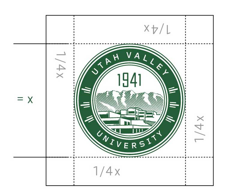
Clear space: To determine clear space, the height of the seal has been defined as “x.” The proper clear space for the seal is at least 1/4x.
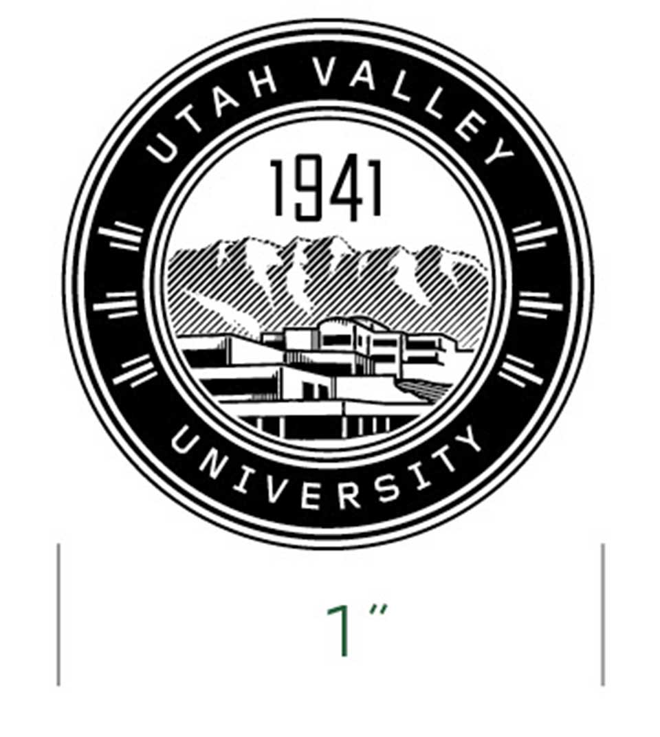
Minimum size: Proper logo size is vital to maintaining readability for the university seal; it should never be reproduced smaller than 1” in diameter.
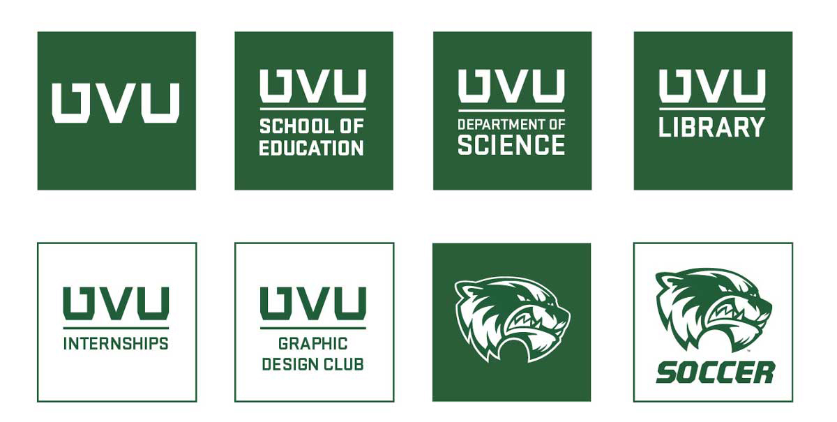
Official secondary marks identify UVU’s colleges, schools, departments, programs, centers, and institutes. These lockups maintain a unified visual identity across campus. Internal campus units may not create their own marks. Doing so weakens UVU’s brand, confuses audiences, and undermines university messaging.
Co-branding partnerships are based on contractual agreements between the university and its external partners and need appropriate approvals before being created. For additional information, please contact Trademarks and Licensing at [email protected].
Requests can be submitted at www.uvu.edu/marketing/create/. All requests require approval from an AVP, associate dean, or higher, and final review by the trademark and licensing team.
Custom logo creation is not permitted.
Center Stack
Side Stack
Tertiary System-Center Stack
We care about collaborative partners. Co-branding partnerships should always uphold the university’s identity and recognize external partners appropriately.
Co-branding partnerships are based on contractual agreements between the university and its external partners and need appropriate approvals before being created. For additional information, please contact Trademarks and Licensing at [email protected].
Sometimes it is necessary to promote an event or program that is sponsored by two or more school areas. Above is an example of campus partnerships that remove the redundancy of too many monograms on one piece.
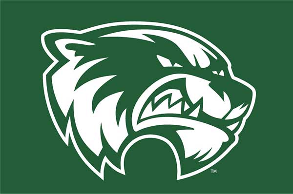
Athletics are a powerful expression of school spirit, pride, and community. Our Wolverine mark and athletic identity represent the energy, resilience, and determination of UVU’s student-athletes and the passionate fans who support them.
Athletics marks follow a distinct set of guidelines. These standards ensure that our teams are represented with strength and consistency across every jersey, banner, and piece of fan gear. When used correctly, these marks rally not only school pride but also brand recognition on regional and national stages.
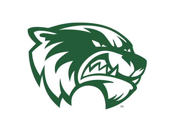
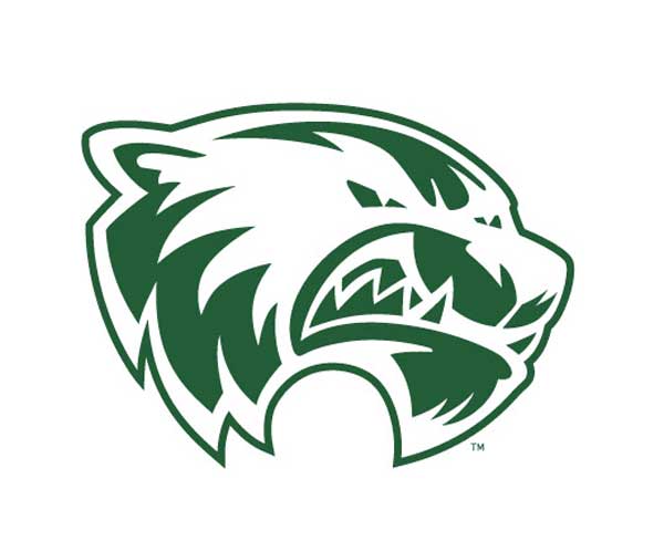
The Wolverine mascot mark is a spirited symbol of UVU Athletics and is reserved exclusively for athletic programs, spirit initiatives, and approved student life materials. It embodies competitive energy, school pride, and the unique voice of our athletic identity.
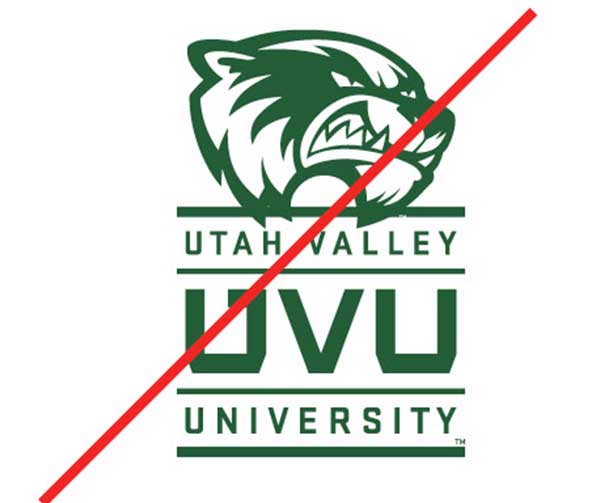
To maintain brand clarity and avoid confusion, the Wolverine mascot mark should not be used in academic, administrative, or university-wide communications. This includes departmental materials, recruitment collateral, faculty communications, and official university events. These groups should use the core UVU brand elements — such as the institutional logo, colors, and typography — to represent the university in a unified and professional manner.
Misuse of the mascot mark can dilute both our academic credibility and the distinct voice of our athletic programs. When in doubt, please consult with University Marketing and Communications before including the mascot mark in any design.
Reversed version: Please do not try to reverse the original version. Special reversed files for all logos have been created for you, and you can download them at uvu.edu/marketing.
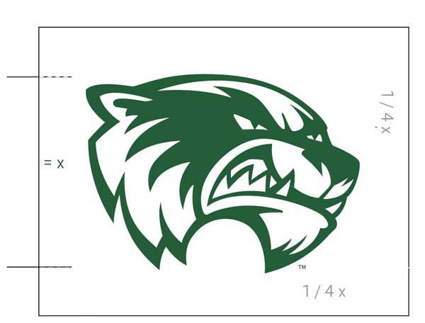
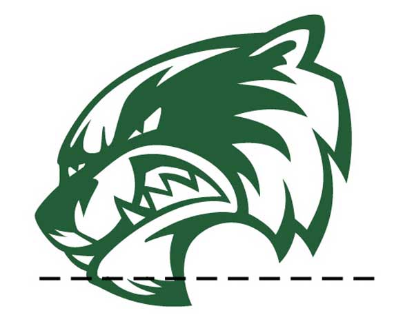
Clear space: To determine clear space, the height of the primary athletic mark has been defined as “x.” Clear space should be at least 1/4x.
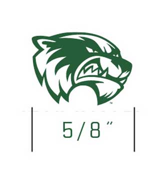
Minimum size: Reproduction should be accurate and legible. Do not use the logo if a small size or production process distorts the graphic.
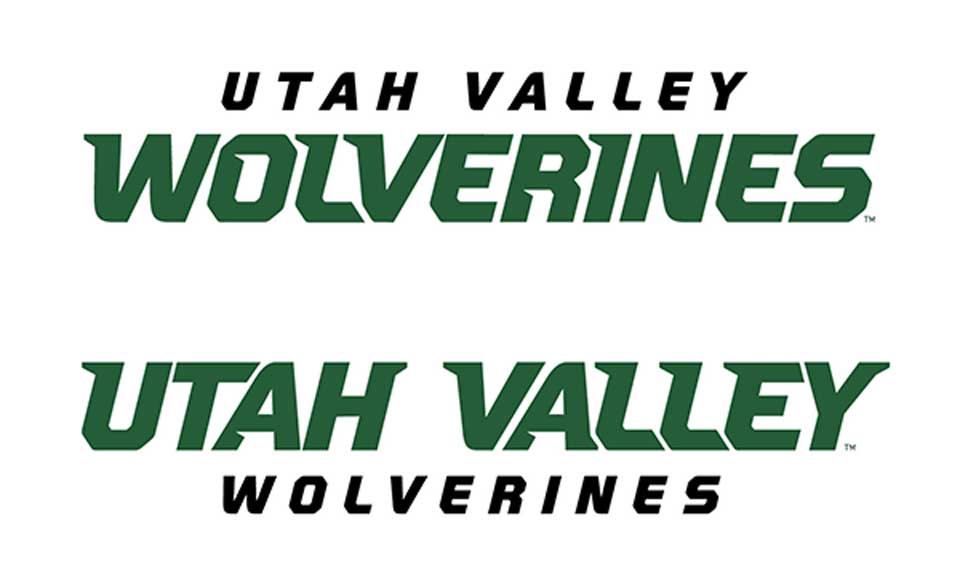
The UVU Athletics lettermark is a bold, high-impact visual used to represent Wolverine sports programs. It is reserved for athletic contexts, including team uniforms, fan gear, spirit promotions, and official athletics marketing. The lettermark reinforces UVU’s athletic identity and school pride and should remain distinct from the institutional logo used in academic and administrative settings.
When collaborating with UVU Athletics, co-branded materials must follow a clear hierarchy.
The UVU Athletics lettermark may be used in joint projects that directly support athletic events or initiatives, but it should never replace the official UVU logo in university-wide or academic materials.
Any use of the UVU Athletics lettermark outside traditional sports settings requires prior approval from both UVU Athletics and University Marketing and Communications.
Typography included in the official institutional and athletic logos cannot be changed or altered in any way.
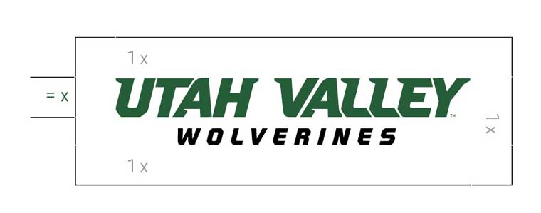
Clear space: To determine clear space, the height of the "Utah Valley" has been defined as “x.” Clear space should be at least 1x.
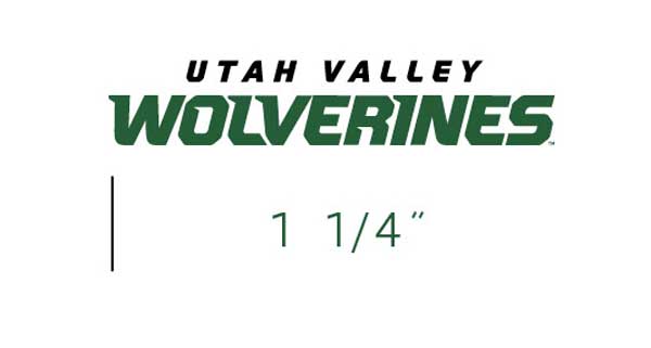
Minimum size: Reproduction should be accurate and legible. Do not use the lettermark if a small size or production process distorts the graphic.
The examples shown here illustrate a number of incorrect uses and are not intended to be a complete list. Never apply these examples. If you are not sure about the permissibility of any particular application, please contact University Marketing and Communications.
Don't Alter the color.
Don't reverse the logo for use on a different background. A specific logo has been designed for this purpose.
Don't alter the proportion of the logo horizontally or vertically
Don't alter the relationship between the lettermark and the mascot mark.
Don't reflect or mirror the mark so it is facing left instead of right. Do not rotate or tilt the mark.
Don't partner the UVU Athletics Lettermark with nonathletic departments or programs.
Color is one of the most immediate and powerful ways people recognize Utah Valley University. Our bold, distinctive green sets us apart—and when used consistently, it reinforces our presence, pride, and personality.
The UVU color palette is designed to be flexible but focused. Primary colors provide a strong, recognizable foundation, while secondary colors offer range and expression across various communications and environments. Consistency in how we apply color strengthens the brand and helps every unit feel like part of the same university.
This section outlines our official color values, contrast recommendations, and best practices for combining and applying UVU’s palette across digital, print, and merchandise.
UVU’s primary brand colors are PMS 7483 (UVU Green) and white. These two colors form the core of the university’s visual identity and must be used consistently to strengthen brand recognition, build affinity, and maintain trust with our audiences.
UVU Green plays a major role in establishing our identity and should be implemented consistently in all web applications and print communications.
White should be used intentionally to provide clarity, space, and contrast across all applications. No alterations or substitutions of these primary colors are permitted.
Adhering to defined color standards is essential for brand consistency. These visual guardrails ensure a unified look and feel across departments, campaigns, and media, helping UVU present itself as a confident, cohesive institution.
UVU’s secondary and accent color palette is intended to complement and support the primary brand colors — UVU Green and White — while offering flexibility for specific design needs. These colors work best for adding visual emphasis in elements like charts, graphs, icons, alerts, and hyperlinks.
Use secondary and accent colors intentionally and in moderation. They should never overpower the design or replace primary colors. Avoid large areas or backgrounds in secondary colors and do not allow them to become the dominant color for any college, department, center, or initiative.
Accessibility is essential. All color combinations must meet WCAG AA or AAA contrast standards to ensure readability and inclusivity — especially in digital formats. Use tools like the WebAIM Contrast Checker to confirm compliance.
Using Color With Purpose
Color plays a powerful role in reinforcing UVU’s brand identity. To ensure consistency and impact, our primary color palette should lead in most applications. The secondary palette provides complementary tones that support the primary colors without overpowering them, while accent colors are best used sparingly to highlight key elements or add energy to specific designs. Maintaining a balanced ratio — favoring primary colors, supporting with secondary, and limiting accent use — is essential for a cohesive and recognizable brand presence.
Rule of Ratio
Secondary colors should be used intentionally to support the primary palette. They work best in small doses to highlight key information, accentuate calls to action, or add contrast in data visualizations. Together, strategic use of color and white space keeps UVU’s brand clean, professional, and visually effective.
Creative Expression
A strong brand allows room for creativity while maintaining consistency. Creative expression should be balanced through color, photography, layout, and supporting graphics. The balance between expression and function can shift depending on audience, platform, and purpose, but the brand’s core identity should always remain clear and recognizable.
Overuse of Secondary and Accent Colors
Secondary colors are designed to support — not define — the UVU brand. Using them in large fields or as the dominant color in a layout weaken the UVU Brand. Keeping UVU Green at the forefront ensures our brand remains strong, consistent, and instantly recognizable.
Typography is more than just selecting fonts — it’s how we express our tone, establish hierarchy, and guide the reader’s eye. At Utah Valley University, our type choices reflect our personality: bold, modern, and grounded in clarity.
Consistent use of approved typefaces helps unify our communications across platforms, departments, and audiences. It ensures that no matter where someone encounters UVU—on a website, a billboard, or a social post — they experience a recognizable and cohesive brand.
This section outlines our core and supporting typefaces, usage best practices, and examples of how to apply them across different formats. When used correctly, our typography doesn’t just look professional — it reinforces who we are.
Stratum is UVU’s primary typeface and the foundation of our visual identity. It establishes a clear, consistent voice across all communications and should lead in most applications — from headlines to body copy.
To support a range of audiences and contexts, a limited set of complementary typefaces may be used alongside Stratum. These fonts help define hierarchy, tone, and emphasis, adding flexibility without compromising brand integrity. When used purposefully, they bring clarity, character, and cohesion to our storytelling. Use university typeface to:
Ideal for: Headlines/Subheads/Body Text
Modern, structured, and highly legible, Stratum reflects UVU’s forward-thinking mission and visual identity. It is designed to inspire confidence through clarity and consistency and to reflect the strength and purpose at the core of our brand.
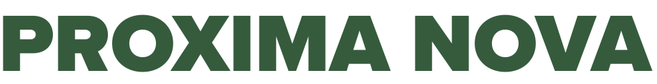
Ideal for: Headlines/Subheads/Body Text
Proxima Nova offers warmth and versatility while staying modern and neutral. It pairs well with Stratum in digital and marketing materials, especially where a softer tone or broader digital compatibility is desired.
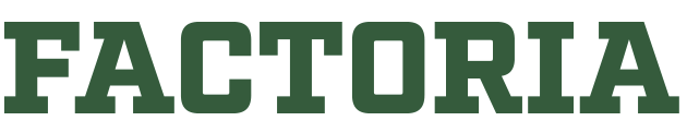
Ideal for: Headlines/Callouts
Factoria adds fun, energy, and a classic collegiate feel — ideal for student activities, event graphics, and campaign headlines. Use sparingly to bring personality and emphasis without overpowering Stratum.
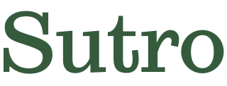
Ideal for: Subheads/Quotes
Sutro adds elegance and formality — ideal for presidential messages, ceremonies, or high-level invitations. Use sparingly for moments that call for distinction.
Ideal for: Subheads/Body Text
Designed for screen readability, this typeface reflects inclusivity and supports long-form digital content or accessibility needs.
Every touchpoint matters — whether it’s a campus email, a social post, or a university-wide campaign. This section introduces the essential visual tools that bring consistency and clarity to all UVU communications. From icons and patterns to templates and email signatures, these brand elements help reinforce who we are and how we show up: unified, professional, and distinctly UVU.
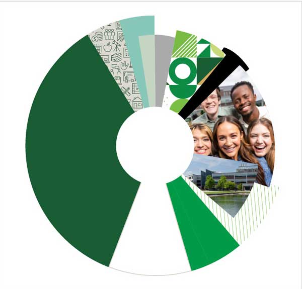
Create designs that express UVU’s personality while staying rooted in brand consistency. Onbrand patterns, motifs, and graphic elements introduce texture, rhythm, and visual interest, but they should always support the content, not overpower it. These elements work best when used intentionally to enhance layouts while maintaining a balanced visual hierarchy.
When incorporating patterns and motifs, consider their scale, placement, and color ratio in relation to UVU’s core palette of green and white. These accents should complement — not compete with — the primary message or UVU's brand identity. Use patterns as subtle backgrounds, framing devices, or secondary elements that reinforce the UVU look and feel without overwhelming it.
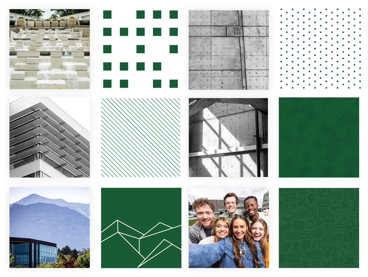
Icons are a visual shorthand that can enhance clarity, support storytelling, and make your message more engaging. Our icon library was created to reflect UVU’s brand personality with clean, modern, and purposeful design.
Use icons to highlight information, guide your audience, or bring visual interest to your layout without overwhelming it. Avoid mixing styles or using unapproved icons, as consistency builds recognition.
The full icon library includes symbols for a wide range of university topics. Work with your area designers to gain access to the master Adobe Illustrator file.
![]()
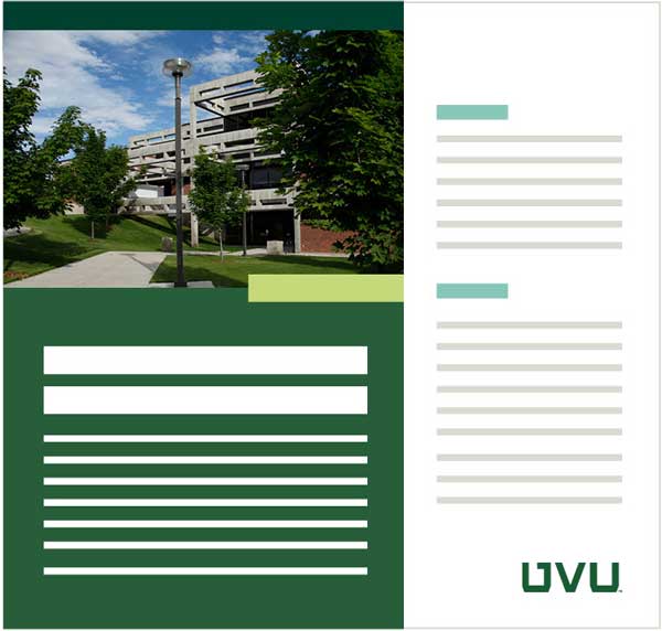
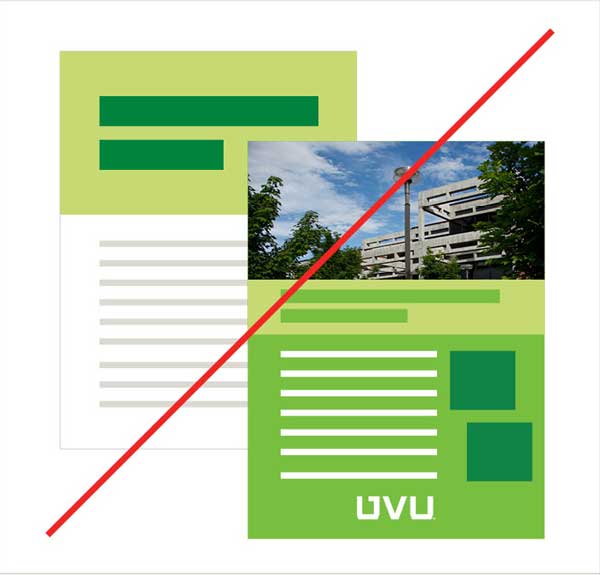
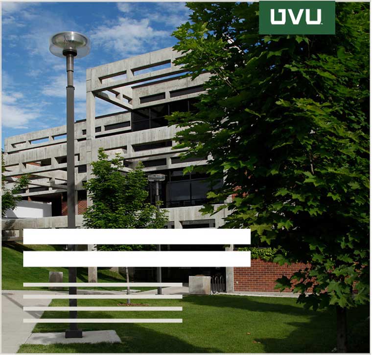
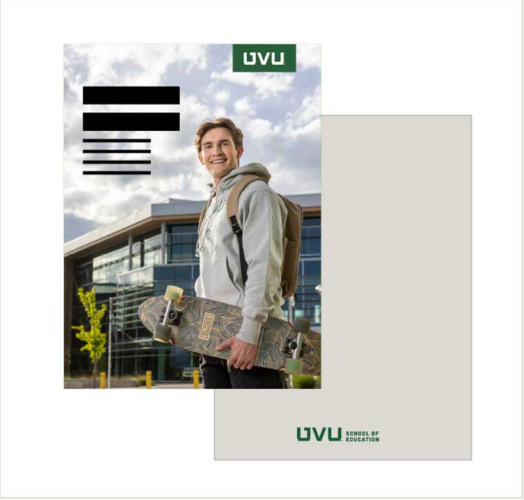
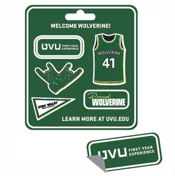
UVU Green Monogram tabs provide additional flexibility. Use over photos and white backgrounds to strengthen brand recognition.
Specifications and guidelines
Rule of Ratio
Use a monogram tab on white space in a layout to increase brand recognition. Don’t enlarge a logo tab in a way that overpowers the layout.
Contrast and Brand Presence
Use the monogram tab when the logo is displayed over photography to enhance brand presence and accessibility. Don’t float a monogram tab. Always anchor it to a top or bottom edge of the layout and don’t extend any side of the tab.
Brand Hierarchy
When a Monogram tab is required, unit lockup can be displayed separately on the back. Don’t incorporate text or other graphics with a logo tab.
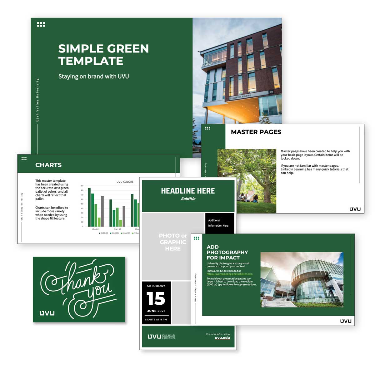
Templates help maintain consistency across UVU communications while saving time and effort. Whether you're creating presentations, social media graphics, event flyers, or digital signage, our branded templates ensure your work aligns with the university's visual identity.
We offer a curated set of flexible templates designed for various needs — from formal academic settings to casual student life events. Each template follows UVU’s brand standards, including approved colors, typefaces, and logo placement guidelines.
To make content creation even more accessible, Adobe Express is available for free to all UVU employees using their university credentials. This user-friendly platform includes a growing library of UVU-branded templates you can easily customize without the need for advanced design software.
Unique marks are used when they serve a clear, strategic purpose, such as promoting a time-bound event, campaign, or university-wide initiative where added visual interest helps drive engagement. These graphics should be thoughtfully designed to complement UVU’s core identity, not compete with or replace it.
Unique marks are not permitted as standalone mark for departments or offices, as this can lead to confusion and brand fragmentation.
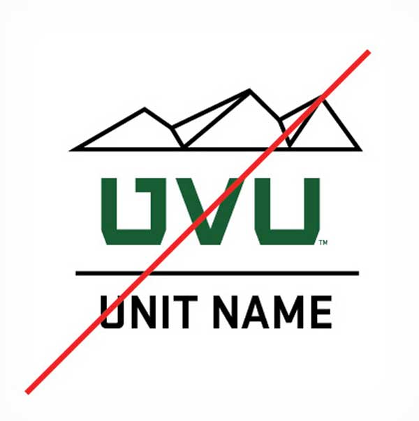
Don’t Stylize Your Unit Name
Avoid designing unique graphics that feature your unit name as part of the artwork. This creates logo-like visuals that can confuse audiences and weaken UVU’s official branding.
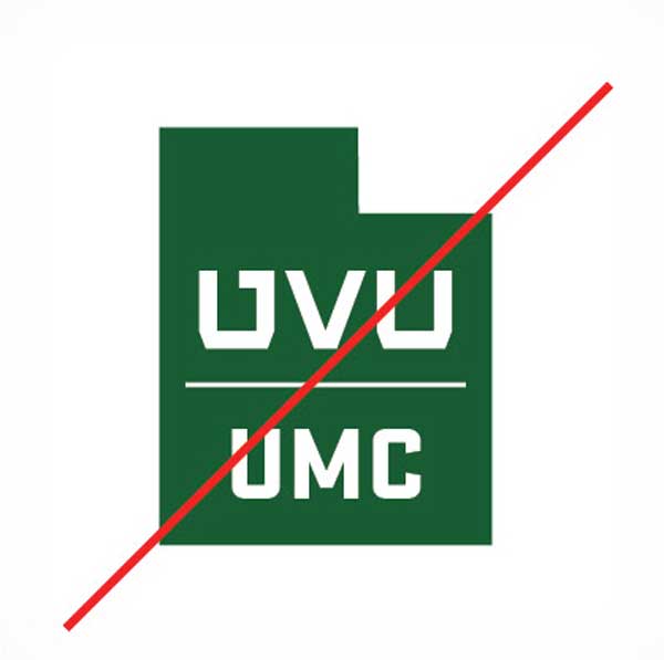
Avoid Acronyms and Names That Include UVU
Spell out unit or program names for clarity. Avoid using “UVU” to prevent redundancy and misuse of the block logo or off-brand typefaces.
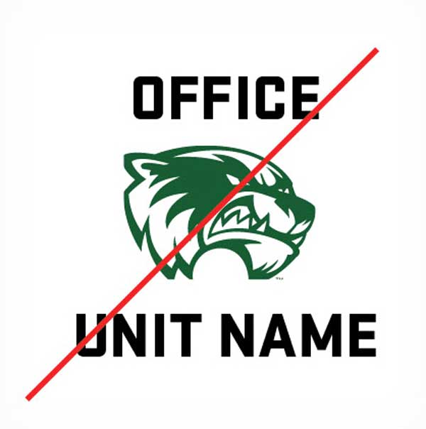
Wolverine Mark Usage Is Restricted
The mascot character is reserved for UVU Athletics and may only be used with approval from University Marketing and Communications or authorization from UVU Trademarks and Licensing.

Leverage UVU brand Colors and Fonts
Unique graphics should primarily use UVU’s primary and secondary colors with minimal use of accent colors to maintain brand consistency.
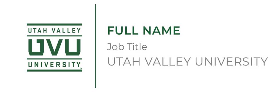
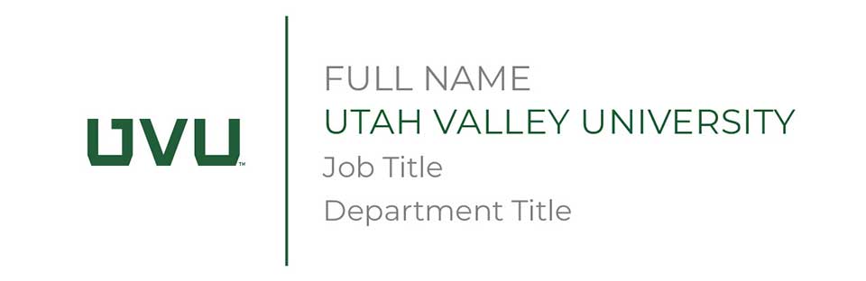
Your email signature is one of the most consistent brand touchpoints we have. Whether you’re emailing a student, a partner, or a donor, it speaks on behalf of UVU. A unified, professional signature helps reinforce the university’s credibility and trust.
We’ve made it easy to stay on brand using UVU’s Email Signature Builder. You just fill in your info and copy the result into your email program.
Stationery and business cards can be ordered directly from Print Services. A digital stationery file can also be requested. Place an order for stationery at uvu.edu/printingservices.
Utah Valley University’s name, logos, and visual identifiers are trademarked assets—they represent our reputation, values, and public image. These guidelines exist to protect those assets and ensure they’re used appropriately, especially on merchandise, apparel, and promotional items.
All products bearing the UVU name or marks must be produced by a university approved, licensed vendor. This not only ensures consistent quality and brand presentation — it also protects UVU and our partners from legal and reputational risks.
Before you place an order, launch a campaign, or design swag, check this section for licensing rules, usage permissions, and how to ensure your product meets official standards. When we all follow the same guidelines, we safeguard the integrity of the UVU brand—for everyone.
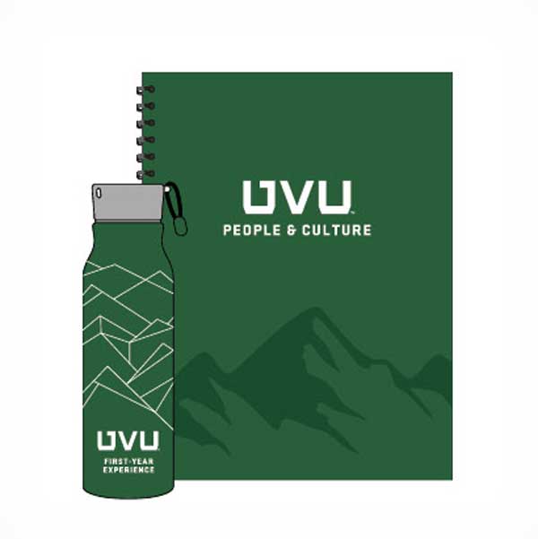
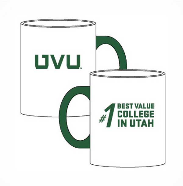
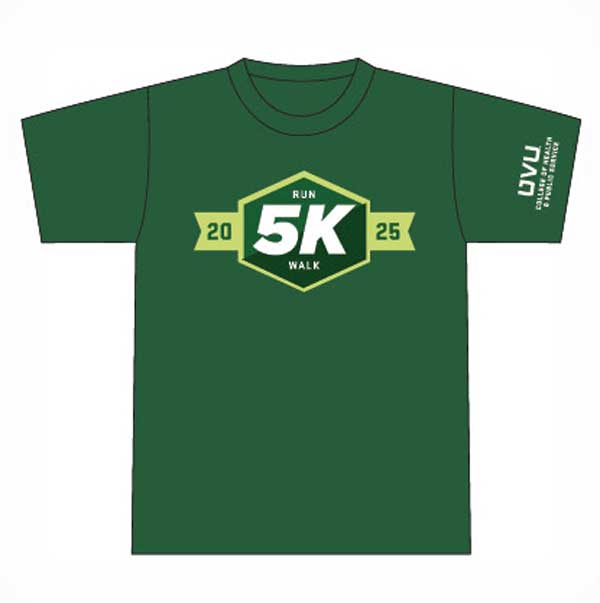
Look good. Feel proud. We love seeing UVU gear worn proudly in the community. Branded merchandise builds recognition and school spirit, but only when it’s done right.
That’s why it’s essential to use the correct colors, logos, and brand standards on everything from T-shirts and tumblers to banners and backpacks. Consistent, high-quality design strengthens our reputation and shows the world who we are.
To help with that, UVU has a simple purchasing and approval process in place to ensure all merchandise reflects our brand accurately and professionally. We’ve also created ready-to-use templates and resources to make your job easier.
Download approved templates, product guidelines, and more at uvu.edu/marketing.

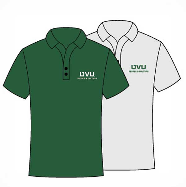
A business-casual classic. Choose a polo shirt designed with UVU’s colors and logos.

UVU branded flags flying gracefully in the wind or displayed elegantly on an office wall; the dream is but a click away.

Like a flag, but pointier. Great for giveaways at events or to show your school pride.

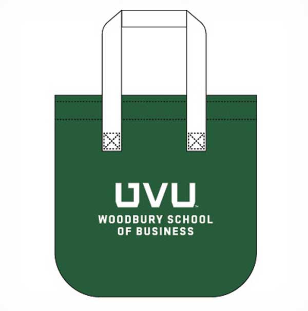
UVU swag needs a UVU swag bag. Perfect for conference attendees to collect their business cards, flyers, and pens.

Saving furniture from drink condensation and showing Wolverine pride in one cute coaster.
Promotional items are a valuable tool for increasing visibility and school spirit across campus. However, to maintain brand consistency and reinforce UVU’s visual identity, the use of supporting and custom graphics must follow the guidelines on this page.
Custom graphics and swag should serve a clear purpose, such as increasing engagement, recruitment, or brand awareness. Excessive spending on purely decorative or trend-driven items without clear objectives is discouraged. The marketing team can provide guidance on effective, brand-aligned merchandise strategies.
Keep it UVU
Keep it simple and use your official lockup or UVU monogram as the primary artwork.
Stay Simple
Use brand patterns subtly — like behind large display text — so that readability remains strong. When applied thoughtfully, UVU patterns make designs feel distinctive, polished, and unmistakably ours.
Strong Branding
Use brand fonts to display pride points unique to your unit or program. Display the UVU monogram or your unit lockup separately.
Embrace Core Identity
Reserve left and right chest areas for the official UVU logo or approved unit lockup only. These key branding zones should not feature unique graphics to ensure clear recognition and reinforce UVU's core identity.
Purposeful Promotions
Promotional items should always support a strategic goal. Every item must include the official UVU logo or secondary mark placed separately from any unique mark to avoid brand confusion and ensure visual clarity.
Consider Sticker Sheet
Sticker sheets are cost-effective and popular with a variety of audiences. Use your unit lockup and messages unique to your unit or program.
All products bearing the UVU name, logos, or trademarks must be produced by officially licensed vendors. This requirement is in place to uphold the integrity of the university’s brand and to ensure that every item bearing our identity meets established quality and compliance standards.
Trademark licensing is not merely a procedural formality it is a critical measure that protects both the university and our partners from potential legal and reputational risks. By working exclusively with approved vendors, we safeguard against misuse of UVU’s intellectual property and reinforce a consistent, professional image in every branded product.
This process also ensures that vendors are held to the same expectations we place on ourselves: accuracy, consistency, and respect for the brand. Whether you’re ordering apparel, promotional items, or printed materials, using a licensed vendor is the only authorized path.
For licensing details and a list of approved vendors, please visit uvu.edu/marketing/licensing.

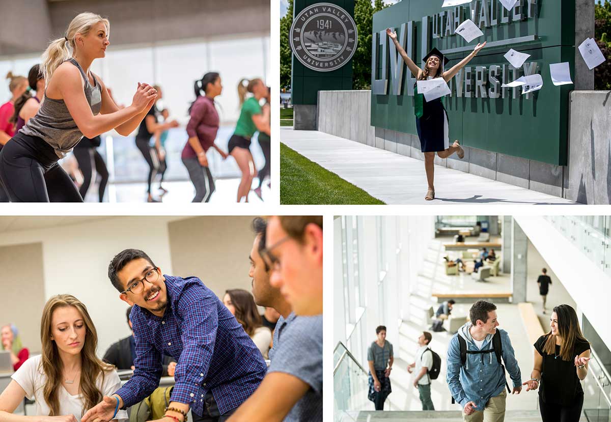
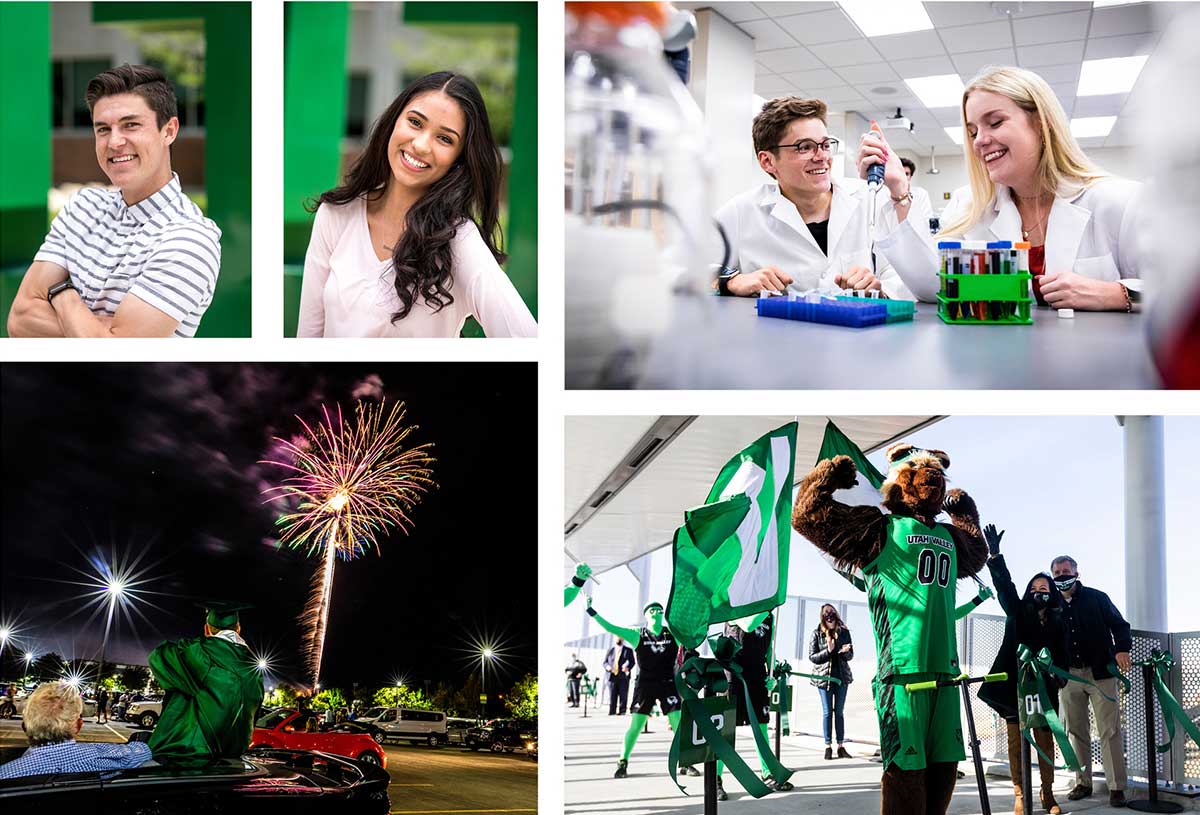
Photography plays a powerful role in shaping the way people see and understand UVU. Whether you're capturing campus life, student success, academic programs, or community events, your photos should feel unmistakably UVU — authentic, inclusive, and professionally composed. Using consistent visual style across all communications strengthens our brand identity and helps audiences immediately recognize content as part of the official UVU story.
As technology accelerates, visual communication becomes more important — and attention spans continue to shrink. Great photos can cut through the noise and grab the audience’s attention.
The best photos capture a compelling narrative that evokes an emotional response in the viewer. We’re here to help you tell those stories.
We collaborate with campus community members to understand your unique needs and create the greatest impact. UVU Photo will guide photo sessions and use creative post-processing techniques to help you fulfill your vision and connect with your audience.
To request photo services and view UVU Photo’s charging structure, visit uvu.edu/marketing/photography.
High-quality campus photos are readily available at the University's Photoshelter with the link below:
All galleries require a password which is:
"gogreen" (in all lowercase letters)
Be sure to browse the UVU Photo Gallery at uvuphoto.exposure.co for examples of powerful visual storytelling.

These guidelines are designed to help your audience quickly recognize that your social media account is officially affiliated with Utah Valley University. A consistent visual and verbal presence across all platforms strengthens trust, reinforces UVU’s brand identity, and helps distinguish official accounts from personal or unofficial voices.
Whether you're managing a college, department, program, or initiative account, these standards ensure that your content feels connected to the larger UVU brand while still allowing room for your unique personality and voice to shine through.
Follow these best practices to make sure your content looks and sounds like UVU and contributes to a unified presence across campus channels.
The handle of all social media accounts should start with UVU.
Examples:
@uvuXXXX or @uvu_XXXX.
Page names should state the department or program followed by the words “at UVU”.
Examples:
@uvu_nursing would be: Nursing at UVU
@uvuadmissions would be: Admissions Department at UVU
@uvu_fultonlibrary would be: Fulton Library at UVU
Should a crisis occur, do not share, post, or comment regarding the incident on your social media channels, and do not reshare information or posts from main university channels.
Profile images must be approved before they are used.
To request your custom profile image, please email [email protected].
Be committed. Know who your audience is and provide value to them by posting relatable content consistently.
Be active. Interact with your followers when appropriate and make your page an engaging destination.
Have a strategy. Create social media strategies that support your department’s objectives and help you meet your goals.
Polish your visuals. Use high-resolution images, videos, and graphics.


